Starship.fm
UI/UX design case study in music exploration
Overview
Starship.fm is an active music exploration app, meant to live alongside existing streaming services. Its target audience is those who find Spotify or other services' "exploration" features to be lacking.
This design was created as part of the DSGN 2570 (UI/UX Design) course at UPenn.
The goal
Originally, the goals for this project were much looser. I wanted to incorporate the idea of a visually mapped out web of musical genres and artists, as well as allow users to dynamically explore said map. Along with this, I wanted to allow users to leave "notes" or something similar behind for each other, creating unique moments of realization that a friend is a fan of some music without recommendations being made back and forth.
However, through user research and testing, the scope was narrowed to a single goal: an interface for active music exploration.
Research methods
Surveys
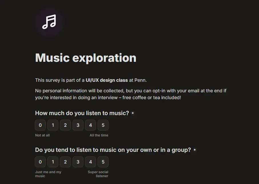
First, in order to gain a better idea of the problems people really have with "exploration" features in existing streaming services, I created a survey which explores various aspects of listening behavior.
Through the survey's ~30 responses, I discovered a few interesting stances on existing streaming apps:
- 56% of respondents liked that the “discover” feature was “close to my existing taste”
- 55% of respondents liked that the “discover” feature had “good variety of music”
- 16% of respondents didn’t like that the “discover” feature had “not enough variety of music”
- 20% of respondents didn’t like that the “discover” feature “doesn't update frequently enough”
Overall, it seemed like users enjoyed their streaming services' "explore" features, but there was a level of discontent surrounding the ability to customize its behavior.
Interviews
I also performed a number of interviews with folks who reported themselves to be more interested in exploring new music.
Yeah, I use 'Discover Weekly' every now and then. I’ll put it on shuffle, wait until I get a really good song, then jump to the album it’s from.
There seemed to be some recurring behavior patterns: users would start from some song they knew or a mix Spotify creates, and keep listening from "autoplay" until they either found a song they really liked, or skipped one they didn't. From there, they might jump to the corresponding artist or album, and continue listening from there.
Design language
In order to represent the idea of "free exploration," my first thought was to use sailing imagery.
However, after some design iterations, I found the language didn't read well unless it was pushed to a more extreme level, at which point it started to clutter the interface. Seeing as this app was supposed to provide users with a relaxing journey, I moved on to a different aesthetic.
Space aesthetics
Although it's somewhat overdone in the app market, I felt that a space exploration theme might better resonate with the overall goals of this project.
After some experimentation, I landed on a pleasant lavender-ish palette, with a saturated "theme" color set and a desaturated "neutral" color set.
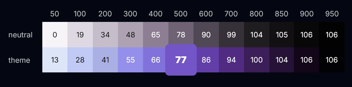

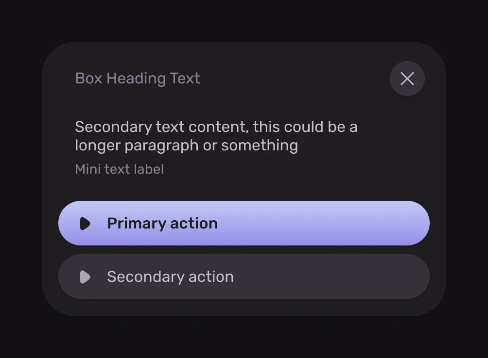
A dark theme would make album art pop, and would be familiar for users of common streaming apps, so I opted to omit any "light mode" alternate designs. These colors are combined with very rounded corners for layout as well as slight shadowing to create a pleasant illusion of depth in a somewhat geometric interface that isn't too hard on the eyes.
I also opted to use MIT-licensed icons courtesy of Myrna UI. These were picked due to their pleasant rounded, geometric look that would go well with the existing colors and typography.
These design choices combine to create a pleasant interface that is unique but also reminiscent of existing media streaming apps. In testing, users responded positively, and so the overall aesthetic remained for the rest of the project.
Iterations
Primary behavior

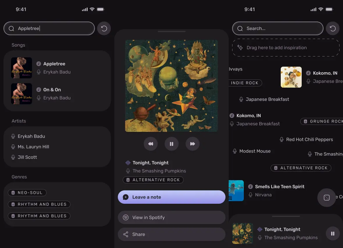
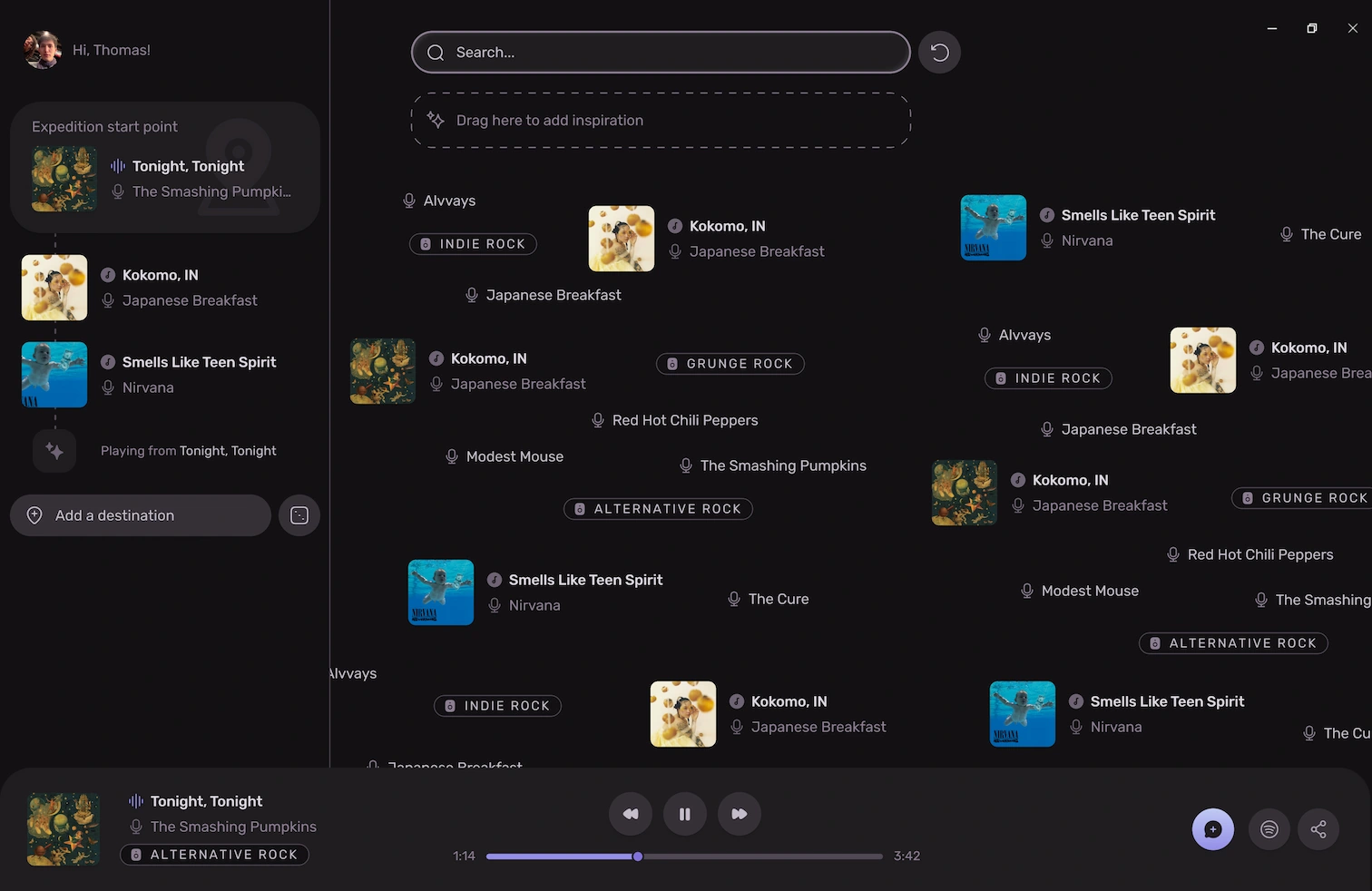
The interface allows users to find music in a number of ways:
- Look up songs, artists, and genres by name
- Explore songs, artists, and genres in a flowing stream of names and images
- Request a completely random song, artist, or genre
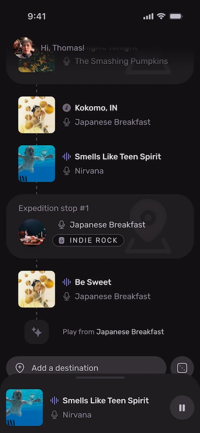
These search methods can also be narrowed by dragging songs, artists, or genres into the "inspiration" box. This will curate the "random" results to more closely resemble said new "inspiration."
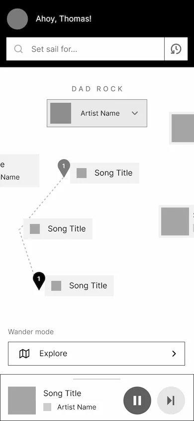
Once they have found an appropriate starting place, users will be prompted to start an "expedition." This is meant to replicate the UI/UX of navigation apps, in which multiple stops can be added to a journey.
This well-known layout along with typical music "queue" behavior (such as swiping to remove an upcoming song) are combined to create a familiar-feeling interface.
User testing
A number of insights and changes were made through the user testing process, in which volunteers attempted various tasks in the prototyped interface.
-
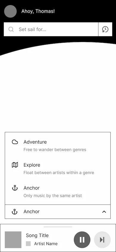
Users looking to do more free-form exploration expected more random options. This led to the return of a design element from early wireframes — the "I'm feeling lucky" button signified by a die.
-
Terminology was confusing for users. Originally, I used the term "adventure" to refer to what is now called an "expedition," and there was inconsistent usage of language surrounding the space aesthetic littered throughout the app. User exploration allowed these problem areas to be quickly found and remedied.
-
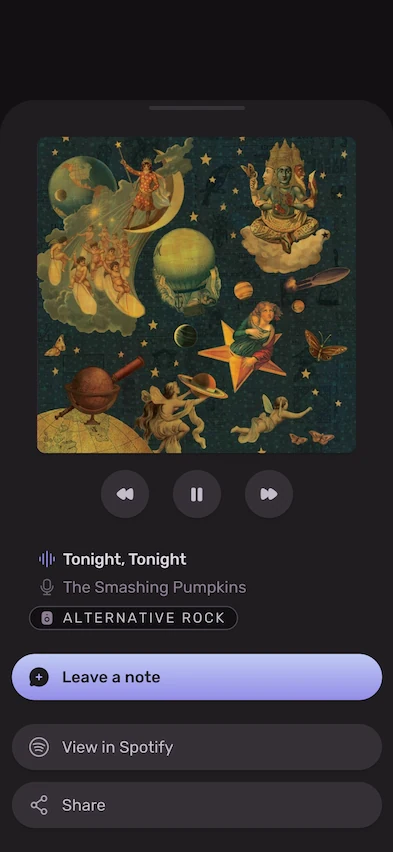
The "Now Playing" panel which lives at the bottom of the screen didn't get much attention at first, and was confusing to users as it looked highly similar to other popups like "song details." To address this, I overhauled the "now playing" popup to instead behave similarly to existing streaming apps, having a huge album art preview and more clearly sectioned off playback controls. It would also be the sole place which users could see friend "notes," de-cluttering the rest of the interface.
Conclusion
From a personal growth standpoint, this project was exciting, as it combined a number of UI/UX patterns from completely different apps. Although the original vision of an all-in-one map + music expedition + social experiment might not have come to pass, I'm happy with the overall direction taken in this project, and the final focuses.
The final mobile prototype can be accessed here.
A huge thank you to everyone who filled out the survey!
Handles optionally provided by respondents:
Audrey Yang, Daniel Gerhardt, Johnny Jeong, Aris, Nico Kong, Icey4x, Kevin Wei, Jesse, Underline Slopper, Jacky Park, 'I've got a finger in every pie', MaceyM, and Kevin Ma
Thank you to the interviewees and testers as well!! This project wouldn't be possible without you.